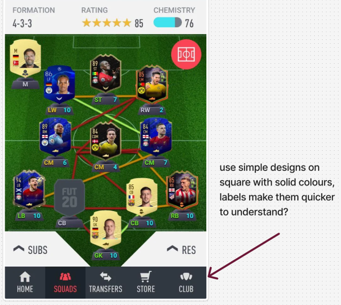
The starting focus of my design process was keeping the overall interactions that the user will have to a minimum, taking into consideration the age of my target audience (35+), other companion apps as well as my other inspirations in candy crush and similar games I continued using trial and error with different layouts and colours to draw attention to the
Before(left) and after
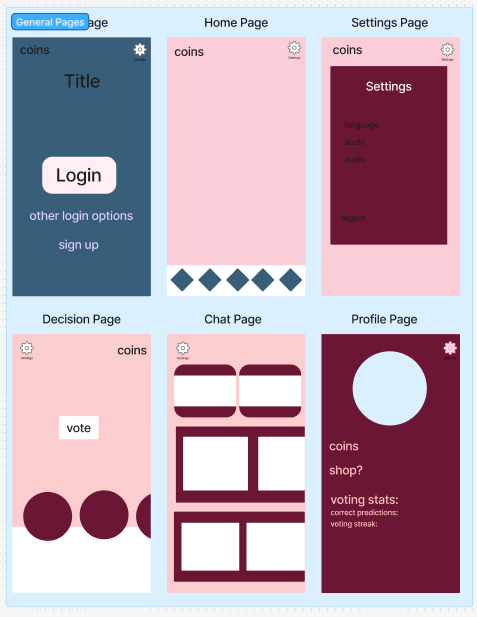
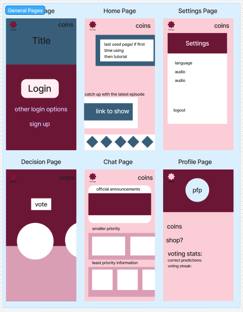
After the user logs in, they will be directed to the home page showing recently used features so that users that mainly use the app for voting and nothing else will be able to do a quick vote without wasting any time and people who play mainly the games or the chatroom can quickly pick up where they left off without interruption. I wanted the user to navigate the screens using the home bar like other mobile companion apps use and I went with different asset layouts for each page to keep them easy to identify where you are on the app.
I made one basic system user flow and then after reading an article on wireframes and sitemaps I had better understanding of the purpose of the flow chart as well as how I could use them to visualise a users experience going through the app, considering the aspects that would make navigation smoother and easier to understand like having options to sign up in the login menu so that they don’t have to go back. The login stage is meant to give simple options that smoothly move to the homepage, where the user can access every option and also be updated on important show updates so that busy people still feel that they can use the app and get the information they need quickly and those who can take their time won’t be at any disadvantage.
(In case embedded figjam link has a visual glitch use full screen to fix)